Visualizing COVID-19 Data with Unity-Based VR Applications
When COVID hit in early 2020, everything stopped. I had just received an Oculus Quest headset a few weeks before lockdown, and with nowhere to go and more time than I knew what to do with, I wanted to build something that actually connected to what was happening in the world. The Johns Hopkins COVID-19 dataset had just gone public, updated daily with global case counts, and it struck me that the data was everywhere but always flat. Maps, bar charts, dashboards. All useful. But there was something genuinely interesting about the idea of stepping inside the data. That curiosity is what started this project.
Pulling Real Data Into a 3D World
The Johns Hopkins CSSE team published their COVID-19 dataset on GitHub as a daily CSV file, publicly accessible and updated every 24 hours. Each row contained a country or region, lat/long coordinates, and running totals for confirmed cases, deaths, and recoveries. For a side project with real-time ambitions, it was a near-perfect data source. Structured, consistent, and meaningful.
The first design decision was deceptively simple: should the app load live data every time it launches, or should it work from a baked-in snapshot? Live data felt right. It meant the experience would always reflect the current moment, and it kept the project honest. You open the headset, you see what's happening today. That intent shaped a lot of the decisions that followed.
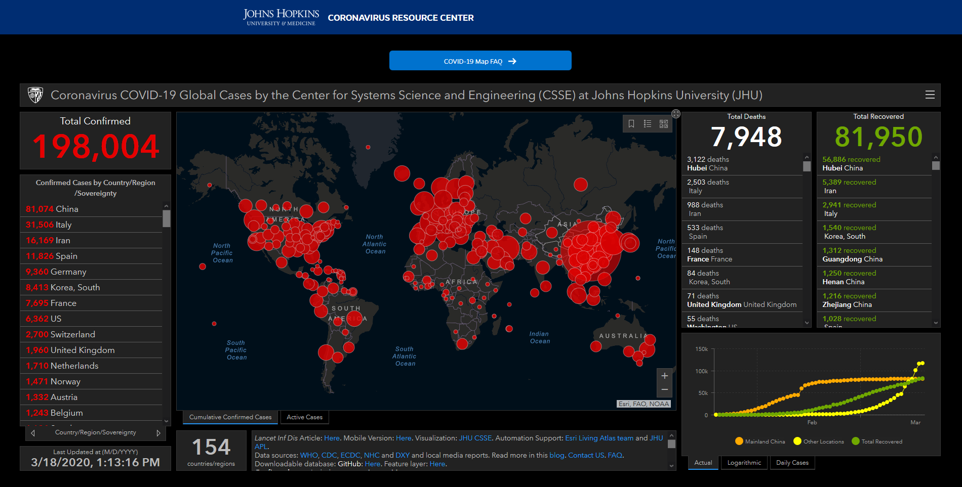
On the Unity side, fetching the CSV at runtime is handled through a coroutine using UnityWebRequest. The data comes back as a raw string, gets split into rows and columns, and is parsed into typed C# objects that the visualization layer can consume. Here's a simplified version of what that fetch and parse looks like:
IEnumerator FetchCovidData()
{
    using (var request = UnityWebRequest.Get(DATA_URL))
    {
        yield return request.SendWebRequest();

        if (request.result == UnityWebRequest.Result.Success)
        {
            string[] lines = request.downloadHandler.text.Split('\n');

            foreach (var line in lines.Skip(1)) // skip header
            {
                var cols = SplitCSVLine(line);
                if (cols.Length < 8) continue;

                records.Add(new CovidRecord {
                    Country   = cols[3],
                    Latitude  = float.Parse(cols[5]),
                    Longitude = float.Parse(cols[6]),
                    Confirmed = int.Parse(cols[7]),
                    Deaths    = int.Parse(cols[8])
                });
            }
            BuildVisualization(records);
        }
    }
}
The date in the Johns Hopkins file URL has to match an actual file in the repo. One of the first product decisions was whether to expose date navigation to users inside the headset. Building a date picker in VR turned out to be its own significant design challenge, which came up later.
Mapping Data Onto a Globe: The Coordinate Problem
Once the data is parsed, each record needs to become something visible in 3D space. The natural choice is a globe, which immediately creates a satisfying spatial relationship between the data and the world geography it represents. But getting there requires converting latitude and longitude coordinates into Unity's world space, plotted onto the surface of a sphere.
From a design standpoint, the radius of the globe matters more than it sounds. Set it too small and data points from neighboring regions overlap into noise. Set it too large and the user can't take in the whole picture at once without physically moving. There's a comfortable middle range where the globe fills your field of view without overwhelming it, and finding it was more of an iterative feel process than a calculated one.
Each data point becomes a small vertical column rising from the globe surface, scaled in height by the normalized confirmed case count for that region and colored on a gradient from cool to warm. Low case counts read as short and blue-green. High counts become tall and red. It's a familiar encoding, but in three dimensions it reads very differently than it does on a flat screen.
In three dimensions, the familiar green-to-red color encoding reads completely differently than it does on a flat screen. The height adds urgency that a 2D chart just doesn't have.
Text is tough in VR
One of the first design failures in this project was attaching text labels directly to every data point. It looks fine in the Unity editor. In the headset, it's an unreadable mess. Overlapping labels, text rotated at inconsistent angles, font sizes that looked reasonable on screen but were either too small to read or too large to ignore in physical space.
The underlying issue is that VR has no concept of a 2D plane to anchor information to. Every label is a physical object in a 3D room, and rooms have perspective, occlusion, and depth in ways that flat screens don't. Showing all labels simultaneously is almost never the right answer.
The better pattern is progressive disclosure based on gaze. When a user looks directly at a data point, that region's label and stats appear. When they look away, it fades out. This keeps the scene spatially clean and makes the interaction feel intentional, like the data is responding to you rather than shouting at you from every direction. Unity's TextMeshPro library also makes a significant difference here over the default UI text system, keeping labels crisp at a wide range of distances thanks to signed distance field rendering.
Performance Is a UX Problem, Not Just a Technical One
Frame rate in VR isn't an aesthetic concern. It's a health concern. Drop below the target frame rate on a Quest and users experience real motion sickness. The early version of this project instantiated a separate 3D object for every entry in the Johns Hopkins dataset, which at peak pandemic data density was well over three thousand individual objects in the scene at once. The frame rate collapsed, and the experience became genuinely uncomfortable to use.
The fix involved batching all the geometry into a single GPU draw call using Unity's instanced rendering, which brought the draw count from thousands down to under ten. But the design lesson here is broader than the implementation detail. Performance in an immersive experience isn't separable from the design of the experience. A visualization that runs at 40fps in a headset is not just a slower version of one that runs at 72fps. It's a different, worse, and for many users unusable product. Performance budget decisions belong in the design conversation, not just the engineering one.
Designing Emotional Context Into a Data Experience
This one caught me off guard. COVID data is not neutral. The numbers in the Johns Hopkins dataset represent real deaths, overwhelmed hospitals, and genuine human loss. When you pull that data into an immersive 3D space and watch red columns rise over specific countries and cities, the emotional register of the experience is much higher than a flat chart produces. It raised design questions that didn't have clean answers.
Should the visualization feel alarming? Calm? Clinical? What happens when a user zooms in toward their home country and sees those numbers up close in physical space? There's a version of this product that feels voyeuristic and almost sensationalist, and a version that feels like responsible public health communication. The difference between those two versions lives almost entirely in design choices: color palette, animation pacing, ambient sound, and how the data is labeled and framed.
In practice, pulling back the saturation of the color palette, using cooler blues and whites rather than saturated reds, and slowing down the data population animation made the experience feel more like a research environment. Small choices with a real effect on how a user emotionally orients themselves to the information in front of them.

Interaction Design Without a Screen
Designing for VR interaction means letting go of almost every assumption flat interface design is built on. There are no hover states in the traditional sense. No cursor. No scroll. The user's hands, gaze direction, and physical movement are the primary inputs, and designing around those requires thinking about interaction in genuinely spatial terms.
Simple things become interesting problems. A date picker, which would be a dropdown or a slider on a flat screen, becomes a physical object the user reaches out and grabs or spins. A tooltip becomes something that floats near a data point and needs to be readable from multiple approach angles. Even a loading state needs spatial consideration. A spinning indicator that makes sense at the center of a flat screen looks strange floating in 3D space.
The spatial constraints also create genuine opportunities. Navigating a globe by physically walking around it, or leaning in to examine a specific region more closely, feels natural in a way that zooming and panning on a mouse-driven map never quite does. The interaction model has to be designed from scratch, but that blank slate is also where the medium's real potential lives.
void Update()
{
    Ray gazeRay = new Ray(
        vrCamera.transform.position,
        vrCamera.transform.forward);

    if (Physics.Raycast(gazeRay, out RaycastHit hit, gazeDistance))
    {
        GameObject hitObj = hit.collider.gameObject;

        if (hitObj != currentTarget)
        {
            currentTarget?.GetComponent<DataPoint>().HideLabel();
            currentTarget = hitObj;
            currentTarget.GetComponent<DataPoint>().ShowLabel();
        }
    }
    else
    {
        currentTarget?.GetComponent<DataPoint>().HideLabel();
        currentTarget = null;
    }
}
What This Project Actually Taught Me
Building this during the first weeks of quarantine was one of those projects that ended up mattering more for what it revealed than for what it shipped. The biggest lesson was that VR data visualization is not flat data visualization with an extra axis. The spatial context changes the experience in ways that reach well beyond the technical layer and into fundamental questions about how people read, feel, and make sense of information.
The problems that were hardest to solve were almost never the implementation ones. Fetching a CSV, converting coordinates, rendering geometry at scale. Those all had answers you could find. The harder questions were the design ones. What does it mean to put someone inside data about a global health crisis? How do you design for clarity without stripping out the weight of the numbers? How do you build something that respects both the data and the person experiencing it?
Those questions don't have code solutions. They require the same intentional, human-centered design thinking you'd bring to any product, just applied to a medium that is still figuring out its own conventions.
In the end, does this actual solve a problem or help improve people's lives? Most likely not, but it definitely was an interesting experience trying to build and worth exploring.
